About Japanese Website Design – Japanese Customer Satisfaction Strategies and Trends


Exploring the peculiarities of Japanese web design often provides unexpected insights for international companies venturing into the Japanese market. Dense blocks of information, minimal use of white space, multiple focal points, and numerous call-to-actions (CTAs) on a single landing page can seem overwhelming or “cluttered” to those familiar with Western design norms.
But does that necessarily mean they’re ineffective?
In this article, we explore some of the most important and fascinating Japanese web design trends. We will also discuss how Japan’s cultural nuances have shaped an industry that creates digital experiences that are in stark contrast to what is considered “ideal web design” in other regions of the world. We will also focus on the effectiveness of SEO strategies in these unique digital landscapes.
IT’S NOT ABOUT RIGHT VS WRONG.
Putting aside the binary concepts of “right” and “wrong” for a moment, the critical step in strategizing your next web development project for the Japanese market is to reconsider what user experience (UX) truly embodies. Instead of thinking of it as a universal measure of quality (ignoring cultural and geographic differences), consider that UX is always tied to the preferences and needs of the individual user.
When it comes to Japanese UX paradigms for websites, it happens that user preferences differ significantly from what someone from a different cultural context might expect.


So instead of dwelling on how a culture known for its minimalist aesthetic and globally recognized design skills can produce such “busy” digital spaces, invest your thoughts in understanding the function of websites and other promotional materials in the context of Japanese culture and society. And think about how your website can adapt to the same standards and expectations.
Tip: User experience (UX) encompasses every facet of a user’s interaction with your brand and its offerings (visuals, images, navigation, communication). If you haven’t already considered how your optimal Japanese audience will perceive your brand, this should be your primary focus when creating a fully localized website for the Japanese market.
KEY FEATURES OF JAPANESE WEB DESIGN
- Inclusion of more text and detailed information up front.
- Less reliance on white space on the page.
- Content focused primarily on facilitating purchase decisions rather than creating emotional connections.
- Use of multiple fonts, including both vertical and horizontal text lines.
- Preference for smaller, more frequent graphics over larger, high-resolution images.
- Emphasis on data, testimonials, and statistics on landing pages to build trust with the user.
- Frequent use of contrasting colors and design elements in compact spaces.
We can help you create a Japanese website.
Understanding cultural context
LANGUAGE AND TYPOGRAPHY
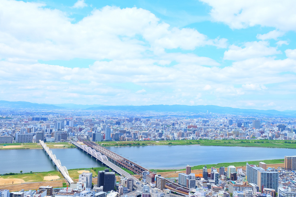
The way text is presented plays an indispensable role in marketing strategies. Contemporary Japanese writing uses a combination of three basic scripts: Kanji, the Chinese ideographic characters, and Hiragana and Katakana, the two phonetic alphabets (syllabics). All three of these scripts can be arranged horizontally or vertically, often resulting in what appears to Western eyes to be a chaotic arrangement. However, this is a common arrangement for the Japanese people.
INFORMATION OVERLOAD?
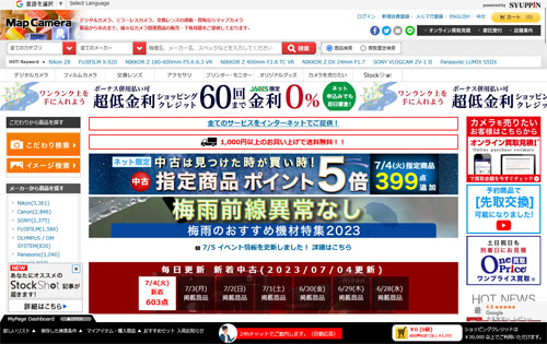
Map Camera – https://www.mapcamera.com/
Japanese web design is often criticized for cramming too much information into a limited space. However, the Japanese demographic generally prefers comprehensive information up front to aid in purchasing decisions. This distinct preference explains the stark visual difference between Western and Japanese websites, and presents a challenge in maintaining consistent web design across both markets.
To appeal to Japanese shoppers, who tend to be more risk-averse by nature, companies must provide more comprehensive and detailed information. A thorough breakdown of product information is essential to enable shoppers to make informed decisions and reduce uncertainty.
In fact, according to the Hofstede Insight cultural analysis report, Japan is one of the top “uncertainty-avoiding” nations, with a high score of 92/100. It also has the second lowest level of trust among the general population, surpassed only by Russia, according to the Edelman Trust Barometer.
As a result, details about production methods, materials, functionality, sales policies, user satisfaction metrics, and more often come to the fore to provide potential customers with all the information they need to make a final decision and dispel any lingering doubts.
Japanese consumers demand more information up front when considering a purchase.
THE PARADOX OF MINIMALIST DESIGN

The Japanese ethos of minimalism and uncomplicated functionality permeates many facets of life in Japan, from urban design to traditional art. Although one might expect similar principles to be reflected in web design, minimalist design runs counter to the basic needs of Japanese consumers, who seek extensive and detailed information up front when navigating websites and other promotional materials.
In addition, Japanese culture abhors waste and seeks to maximize the utility of space – both physical and digital – to provide the greatest value to users. Predictably, this cultural trait conflicts with a fundamentally minimalist approach to web design, instead encouraging companies to utilize all available space on a web page to deliver value to the audience.
These considerations carry less weight in Western societies, which often prioritize creating an immediate emotional connection with users. As a result, Western web designs often limit text and graphic elements to the bare essentials, emphasizing the aesthetic appeal of a page over its ability to inform a user about a product’s functionality.
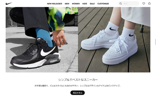
NIKE – https://www.nike.com/jp/
This is not to say that minimalist web design is ineffective in Japan. For example, international fashion labels with significant brand presence in Japan are less concerned about their brands being perceived as trustworthy or high quality. These companies have more flexibility to adopt minimalist designs that mirror their Western counterparts.
Tip: If your web pages are light on information, consumers may question the credibility of your brand and the quality of your offerings. This is the last thing you want when you’re new to the market and trying to establish a positive reputation with a more risk-averse demographic. With this in mind, launching with a home page that contains minimal text and a few images (regardless of their aesthetic appeal) may not be the most strategic approach if your goal is to drive actual purchases.
Prominent Japanese Web Design Styles and Trend
Japanese website designs are captivating and aesthetic. Despite certain design constraints we’ve discussed, the digital landscape in Japan presents infinite sources of inspiration, demonstrating smart usage of space, color, graphics, and technology. Here are some pivotal design trends to bear in mind while crafting your website for the Japanese market.
THE UNCONVENTIONAL AND EXTRAORDINARY
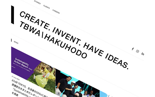
TBWA/HAKUHODO – https://www.tbwahakuhodo.co.jp/
An intentional deviation from standard conventions is a preferred design trend for Japanese websites. The goal isn’t to exhibit extreme chaos or randomness, but to employ shapes, colors, photography, and layout to manifest a unique and distinctive design that stands out.
LIVELY COLOR PALETTES
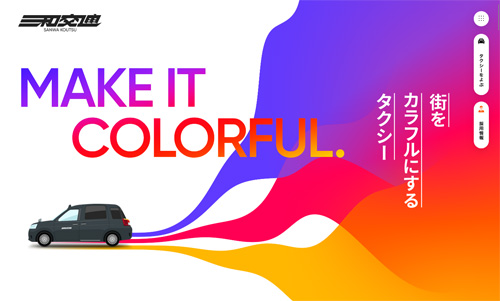
Sanwa Koutsu – https://www.sanwakoutsu.co.jp/
Japanese design embraces a broad spectrum of colors and integrates diverse palettes in website designs. Everything from neon, natural, muted, pastel, or bold hues are welcome and often intermixed within a single page, generating intriguing artistic amalgamations. Such vibrancy is a characteristic feature of top Japanese web designs.
ADORABILITY
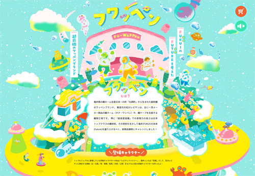
Fuwappen – https://fu-wappen.jp/
The Japanese cultural concept of cuteness, or “kawaii,” pervades across Japan and is mirrored on countless websites. After spending some time here, you’ll likely cultivate your interpretation of what qualifies as cute in Japan, though many might find it challenging to articulate what typifies Japanese kawaii to others. Regardless, this playful appeal is a strategy utilized by thousands of websites today.
CUSTOM TYPOGRAPHY
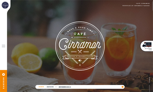
Cafe Cinnamon – https://es-cinnamon.cafe/
Custom fonts serve as a powerful branding and marketing tool that communicates your brand’s personality. In recent years, many Japanese companies have embraced the trend of creating (or commissioning) a custom typeface.
LANGUAGE BLEND
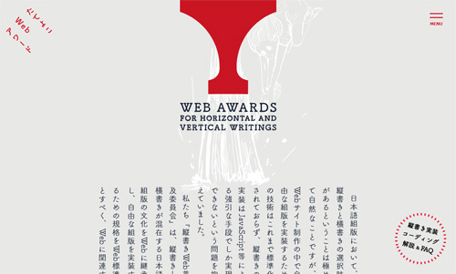
Tateyoko Web Awards – http://tategaki.github.io/awards/
In addition to the multiple scripts discussed above, the Japanese occasionally sprinkle in English phrases. Graphic designers and web developers don’t hesitate to mix these characters to create interesting visual effects or to emphasize certain sections.
CALLIGRAPHY & BRUSHSTROKES
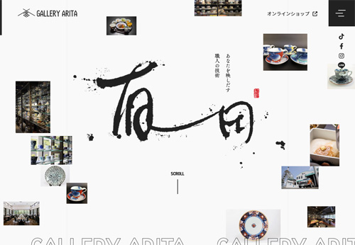
Gallery Arita – https://gallery-arita.co.jp/
Calligraphy is often used in Japanese web design. As a powerful art form and medium for expressing character, emotion, and personality, many web designers strive to integrate calligraphy, vertical lines, and expressive brush strokes into their digital spaces to convey a sense of tradition and artistic expression.
MANGA
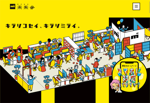
Miraisha – https://miraisha.net/
The wide acceptance of manga characters by the Japanese public, in both animated and static forms, is a facet that the marketing sphere regularly exploits. Japanese web design is following suit, using the appeal of comic-style graphics and characters to effectively communicate their messages to users.
THE VIRTUAL SHOPPING MALL EXPERIENCE
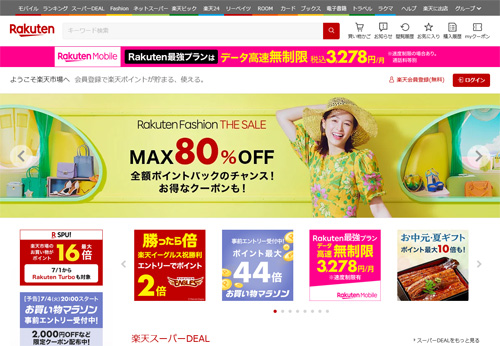
Rakuten – https://www.rakuten.co.jp/
Online e-commerce platforms like Rakuten offer Japanese shoppers a virtual shopping mall experience that caters to their unique needs and preferences. Detailed product information, promotional content, and branding opportunities allow merchants to fine-tune their online stores for better conversions, while providing shoppers with an immersive experience similar to browsing a physical shopping mall.
In addition to using different linguistic scripts, the Japanese often incorporate elements of English into their discourse.
The future of Japanese web design
Yahoo! Japan 2013 vs 2020
In recent years, we’ve seen a wave of new mobile-first websites that attract younger demographics with their simple, smartphone-friendly designs. More interactive web experiences have also gained traction, with rich and dynamic functionality becoming increasingly important. At the same time, many companies have been influenced by international design trends prevalent in Europe and the U.S., nudging them toward a more aligned approach to web UX.
Given these factors, one could argue that Japanese web design will eventually evolve toward a more globally standardized approach. However, it’s also true that many of the country’s largest and most popular companies show little intention of changing their ways, such as Yahoo! Japan, whose homepage design has remained largely identical for nearly a decade.
Add to this the innate need to overcome a lack of trust among Japanese consumers, and the perception that domestic brands catering to the local market are often seen as more reliable and trustworthy, and it seems unlikely that there will be a wholesale adoption of Western design practices.
DEMOGRAPHIC CONSIDERATIONS

It’s projected that the population of people aged 65 and older in Japan will increase from approximately 36.2 million people in 2020 to nearly 36.8 million people in 2025. At the same time, the number of children and people of working age is expected to decline.
Given that Japanese millennials are generally less financially secure than their parents or grandparents, it’s no surprise that many brands (and their websites) tailor their content to older users who appreciate the familiarity of traditional web designs and layouts.
So even though younger Japanese individuals are beginning to favor the aesthetics of more Western-style web design, it’s reasonable to say that classic Japanese web design principles will continue to be widely used for many years to come – serving the demographics most likely to make a purchase.
Tip: Older and younger generations have different cultural perspectives, each with their own preferences and ideals. Understanding and adapting your design based on the consumer group you are targeting is a valuable first step in planning your future Japanese website.
In Japan, millennials often face financial instability and are less affluent than their elders.
As a result, many brands are digitally targeting an older audience.
Building an effective website for Japan
When building a website for the Japanese market, the localization process is critical. To connect with Japanese users, it is not enough to simply translate existing brand content into Japanese. Everything from web design to advertising should start with a solid understanding of the Japanese user.
Website development or localization is best done with the assistance of native Japanese speakers and web development professionals. This will help you adapt your brand in a way that maintains your core values and principles, while presenting yourself in the most favorable light to your new market.
TIPS FOR STRUCTURING YOUR JAPANESE LANDING PAGES
- Use multiple CTAs (calls to action)
- Provide more data and text information up front
- Include official company information
- Use space efficiently (avoid leaving too much white space!)
- Show users real images of your product range
- Show users real people using your products
- Integrate keywords and Japanese SEO considerations from the beginning
We can help you create a Japanese website.
If you’re looking for top-tier ‘website design in Japan, ‘you’ve come to the right place.
Our agency, a leading ‘Japan web development company,
‘provides comprehensive ‘web development services in Japan’ catering to a diverse range of business needs.
Our team of professional developers and designers specialize in ‘website production in Japan.’
We offer ‘website development in Japan’ that isn’t just about creating an appealing layout.
Instead, we ensure a seamless user experience by focusing on ‘Japanese UX/UI design’ and ‘responsive web design in Japan.’
Our ‘web design and development in Japan’ doesn’t stop at merely creating the website.
We provide a full suite of services, including ‘Japanese SEO services,’ to ensure your website gets the visibility it deserves.
Whether you are looking for ‘ecommerce website development in Japan’ or a blog, we have you covered.
We pride ourselves on offering ‘affordable web design in Japan,’ while ensuring top-notch quality.
We’re not just any ‘Japan web design agency’.
We’re a team that listens, innovates, and personalizes.
With us, ‘custom website design in Japan’ takes on a whole new meaning.
Additionally, in an increasingly global world, we understand the need for multilingual platforms.
Our ‘bilingual website design in Japan’ ensures that your message resonates with both local and international audiences.
No matter where you’re based, whether in bustling Tokyo or elsewhere,
our ‘website design services in Tokyo’ are available nationwide.
Choose us for your ‘website creation in Japan’ and experience the difference a professional touch can make.
